西浦设计学院Logo设计大赛:获奖结果公布
发布时间:2020-12-18 08:12:07编辑:阅读()
西浦设计学院Logo设计大赛已经圆满落幕,比赛期间,我们收到了很多来自设计学院学生和老师的优秀创意作品。我们非常高兴地宣布,在经过两轮投票后,我们评选出了三个获奖作品以及七个入围作品。
XJTLU Design School logo design competition has now come to an end. We have received many excellent entries from Design School students and staff, and we are very happy to announce that, after two rounds of voting, we have selected the top 3 winners and 7 shortlisted entry awards for the Design School logo design competition.
获奖作品如下Our winners are
一等奖
First Prize

Logo introduction
The design inspiration comes from the design school's initial letters “D” and “S”. The top is a number "2" lying down, which symbolizes that XJTLU is an international joint venture university founded by Xi’an Jiaotong University in China and the University of Liverpool in the United Kingdom. At the bottom is a number "3" lying upside down, which gives people a sense of stability, symbolizing the stable development of Design School.
In terms of colors, red represents China, blue represents Liverpool, and the combination of red and blue, purple, symbolizes XJTLU. In addition, blue represents broad mind, persistence, calmness, accuracy, and rationality, while red represents positivity, optimism, enthusiasm, sincerity, and courage, which are characteristics I believe design students should possess.
二等奖
Second Prize

<< 向左滑动Scroll left >>
Logo introduction
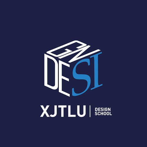
The design concept is the intergration and superposition of representative elements.
Forthe public, the architectural symbol of XJTLU is Central Building, so the designer took the inspiration from the building. Then, the English word "Design" is embedded in the basic layout of Central Building.
In addition, the largest letters "S" and "I", which are also the Chinese Pinyin of "Si"(think). It is widely known that thinking is an indispensable part of design.
The logo as a whole gives people an exaggerated visual impact while retaining a cube, andcreates a kind of asymmetrical feeling while preserving overall stability.
三等奖
Third Prize

<< 向左滑动Scroll left >>
Logo introduction
The designer uses square as the basic element, which is the most used element in Design School. It can be seen as the basic scale in planning and the combination of units in architecture.
In the first logo, squares are arranged into the shape of "D" and "S" which represent the abbreviation of the Design School. The design displays a certain three-dimensional effect, symbolizing architecture and planning exploring positive and negative space.
In the second logo, the design is flatter. At the present stage, everyone is constantly selecting, extracting and reassembling the fragmented information around themselves in the process of learning. The design process is the same by rearranging different elements to make new representations. Based on this concept, the design rearranges the different fragments to form the shapes of "D" and "S" representing the Design School.
入围作品
Shortlisted Entry Award

<< 向左滑动Scroll left >>恭喜以上获奖者,也感谢所有参与本次大赛的同学和老师。我们会在后期对获奖作品进行必要的优化调整,并期待将其进一步投入使用。Congratulations to the winners, and we really appreciate all the students and staff who participated. We will make necessary adjustments to the logo, and we look forward to putting it into actual use in the future.
欢迎关注我们 Follow us
微信号:XJTLU_DesignSchool

你“在看”我吗?
预览时标签不可点 收录于话题 #个上一篇下一篇
https://mp.weixin.qq.com/s/s4lb_S6TAtt8ElnR3jlA9A
关键字词:
相关文章
-
无相关信息
